
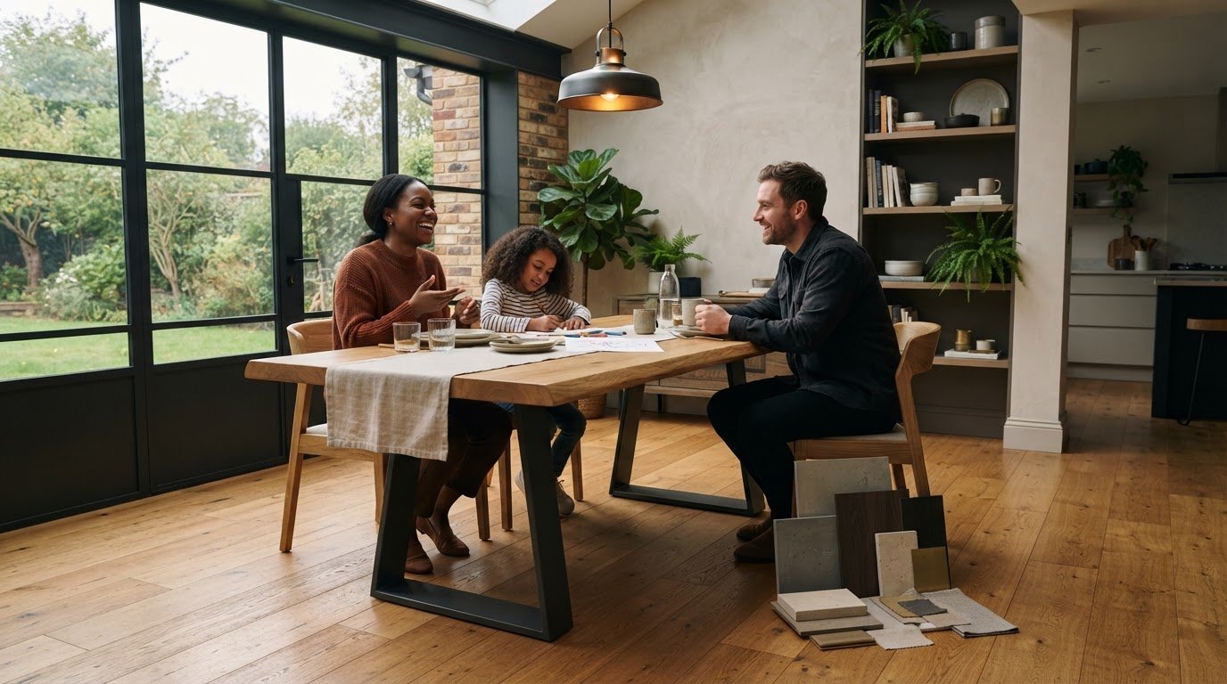
An almost-matching table can look less harmonious than one that clearly contrasts with your floor. It’s tempting to match timber by name or choose from a product photo, but screens can disguise warm and cool undertones, while grain and a dark finish affect how much visual weight a table brings to a room. If you’re wondering how to choose a table that complements your floor, start with the floor itself.
This guide explains how to read your floor’s colour, grain and overall presence, then compare matching, tonal and contrasting approaches. You’ll also see how lighting, furnishings and everyday use can shape the decision. With a clearer sense of what the floor contributes, you can choose a table that feels considered in the room and works for the people who gather around it.
Key Takeaways
- Read the floor’s underlying cast as warm, cool or neutral before settling on a table tone.
- For how to choose a table that complements your floor, weigh tonal harmony against a clear, deliberate contrast.
- Consider grain, texture and reflectiveness alongside colour, especially when the floor has a strong pattern.
- Compare samples beside the floor in daylight and your usual artificial lighting, then view them in the context of the whole room.
- Choose a table that suits the room’s character and the way you’ll use it every day.
How to choose a table that complements your floor: start with what is already there
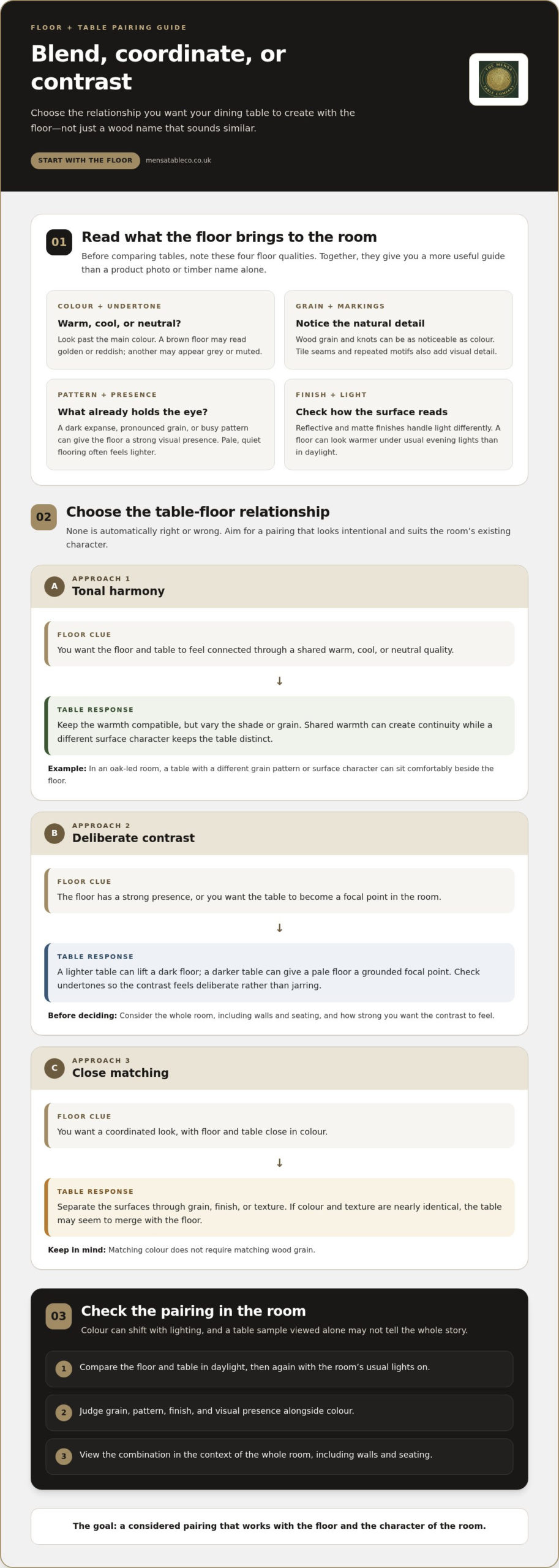
Your dining table and floor don’t need to be identical to feel at home together. A difference in tone or texture can help each stand out. Start with the floor you already live with: note its colour, natural markings, pattern and finish before comparing tables. This gives you a practical basis for how to choose a table that complements your floor, rather than relying on guesswork.
Look beyond the floor’s main colour to its undertone, the subtle warm, cool or neutral cast beneath what you see at first glance. One brown floor may carry golden or reddish warmth, while another looks grey or muted. Neutral floors tend to have less obvious warmth or coolness. These differences matter because colours can change how one another appear. Color Theory in Interior Design offers a useful foundation for thinking about colour relationships and perception.
How to read your floor’s colour, grain and finish
Look at the floor in daylight, then again in the evening with the room’s usual lights on. A surface that seems pale and neutral at midday may look warmer under artificial light. Note the main colour, then ask whether it reads as golden, reddish, grey or neutral. Look at grain and knots, or at seams and repeated motifs in tile or patterned flooring. These details can be as noticeable as colour.
Before comparing tables, assess four things: your floor’s colour, grain, pattern and finish. Finish affects how light moves across a surface. A reflective floor may catch the eye differently from a matte one, even when the colours are similar. This gives you a more useful point of comparison than a product photograph or timber name alone.
What visual weight means in a dining room
Visual weight describes how strongly a surface draws attention and anchors the room. A broad expanse of dark flooring, pronounced grain or a busy pattern can feel dominant beneath a dining table. Pale, quiet flooring often has a lighter presence, leaving more room for the table’s shape, finish and base to become a focal point. Neither is a problem to solve. Simply notice what already holds the eye.
Floor material affects the balance, too. Wood brings grain and tonal variation; tile may introduce grout lines or a repeating layout; stone can have veining and a varied surface. Carpet is softer and generally less reflective, while patterned flooring already provides visual activity. A strongly grained wooden tabletop could feel busy above a lively pattern, whereas a simpler surface may give the eye a place to rest. There’s no universal pairing, so judge the materials together in your room.
Start with what the floor contributes, not with an assumption that a dining set should match it. Once you can describe its colour, grain, pattern and finish, you can decide whether the table should blend in, add contrast or bring a different texture to the room.
Match or contrast? Choose a table tone that works with your floor
Once you’ve read the floor, choose the relationship you want the table to create: a close match, a tonal pairing or a deliberate contrast. These are different approaches, not a scale from right to wrong. Similar warmth can help the room feel connected, while a clearer difference lets the table claim its own place. The aim is to make the choice feel intentional, rather than like a near-match that almost works.
Consider how much visual activity the room can hold. Colour relationships influence perception and atmosphere, as explored in Applying Color Theory to Interior Design. A restrained palette may suit a room that already has plenty of grain or pattern. In a quieter setting, a contrasting table can add definition.
| Approach | May suit a room where… | Possible effect |
|---|---|---|
| Tonal harmony | The floor and table share a warm, cool or neutral quality, but differ in shade or texture. | Calm and connected, with the table still distinct. |
| Deliberate contrast | The floor is visually strong or the table should become a focal point. | Clear definition and a stronger sense of separation. |
| Close matching | You want a coordinated look and can distinguish the surfaces through grain, finish or texture. | Unified, provided the table doesn’t visually disappear. |
When a tonal pairing creates a calm, connected room
For a tonal pairing, keep the warmth compatible but vary the shade or grain. A table with a different grain pattern or surface character can sit comfortably beside an oak floor without disappearing into it. Solid European oak tables are one option to consider in an oak-led room. The aim isn’t to make the floor and tabletop indistinguishable, but to let their shared warmth create continuity.
When contrast gives the table room to stand out
A lighter table can lift a dark floor; a darker table can give a pale floor a grounded focal point. But light against dark is only a starting point. Consider undertones as well, so the contrast feels deliberate rather than jarring. Solid black walnut, for instance, can bring a deeper tone into a lighter setting. Look at the whole room, including walls and seating, before deciding how strong that contrast should be.
Close matching can work, too. Matching colour doesn’t mean matching wood grain: a difference in grain, texture or finish can give each surface its own character. If two surfaces are nearly the same in colour and texture, the table may seem to merge with the floor. A shift in shade or a visible difference in grain can add definition while keeping the room cohesive.
Use these approaches as a first comparison, then consider which suits the room’s existing character. This is a practical way to think about how to choose a table that complements your floor without assuming that matching is the only route to harmony.
Compare the floor and table as materials, not just colours
A dining table is more than a tabletop set against a floor. Its surface, legs and base form a composition with the material beneath it. Wood brings visible grain and natural variation; tile introduces grout lines and repeated shapes; stone may have distinct veining; carpet adds softness, while patterned flooring already carries plenty of detail. Consider how these surfaces feel and catch the light as well as how they look from across the room.
How grain and surface texture change the pairing
Grain can echo movement in the floor, offer a quiet counterpoint or compete with it. If patterned tiles or strong stone veining already draw the eye, a highly grained tabletop may make the dining area feel busy. A simpler surface can bring calm. Matte finishes tend to diffuse light, while reflective ones catch it and can make differences between materials more noticeable. Coordinating Furniture and Flooring also considers how texture and contrast shape a furniture-and-floor pairing.
Colour labels alone won’t tell you how two surfaces will look together. Put material samples side by side, ideally where the table will stand, and notice their texture and sheen from different angles. A wood floor with pronounced knots may pair more comfortably with a smooth, restrained tabletop; a plain tile floor may leave room for more expressive grain. Compare the whole surface, not just a small patch.
Use this comparison to weigh the character each approach could bring:
| Approach | Pros | Cons |
|---|---|---|
| Expressive contrast | Creates a clear focal point and gives distinct materials room to show their character. | Can feel visually crowded if both floor and tabletop have strong patterns or texture. |
| Quiet coordination | Helps a detailed floor feel settled, with smoother or simpler surfaces. | A very similar texture can make the table lose definition against the floor. |
| Mixed materials | Combines the warmth of a timber top with the lighter visual feel of another material in the base or seating. | Too many competing finishes can make the composition feel disjointed. |
How table legs affect the floor’s visual space
The legs change how much flooring remains visible beneath the table. An open design, such as a Spider Leg or X-Frame, lets more of the floor show through and can keep the arrangement feeling airy. A broad, solid-looking base covers more flooring and may read as a stronger visual block. Consider the table’s silhouette as well as the surface below it. The dining table range includes different designs to compare in this context.
With a patterned floor, the visible space beneath an open base can preserve the pattern’s continuity, while a simpler tabletop avoids adding another busy element. On a quieter floor, a more substantial base can provide definition without overwhelming the room. These aren’t fixed rules. Picture the tabletop, legs and flooring together instead of judging each detail on its own.
That complete view is central to how to choose a table that complements your floor. Ask whether the materials share the visual work comfortably: does one surface lead while the others support it, or are several details competing for attention? The answer can point you towards a table that feels at ease in the room and gives the floor its proper place.
Test a table-and-floor combination in your room before deciding
A timber sample that looks right online can read differently beside your actual floor. Light, nearby colours and the scale of the room all influence the impression. Before settling on a table, test the combination where it will live and look at it as part of the space, not as two isolated swatches.
Use this simple process to make the comparison more reliable:
- Gather samples. Collect a timber sample or finish reference for the table, along with any floor sample you have. If the floor is fitted, take the table sample to the room and place it directly on the floor.
- Compare them in place. Set the samples beside one another near the table’s intended position. View them from standing height and from a seated viewpoint, since the relationship can shift with your angle.
- Check different lighting. Look at the pairing in daylight and again with the room’s usual artificial lights on. Notice whether the surfaces still feel at ease together when the light changes.
- Review the whole room, then reassess. Bring wall colour, chairs, curtains and other textiles into the picture. Step back and decide whether the table belongs in the room’s overall palette, rather than judging it only against the floor.
A simple sample test for colour and texture
Keep the samples touching or close together so you can compare their grain, texture and finish as well as colour. Look for a pairing that feels deliberate from both viewpoints and in both lighting conditions. If a sample seems to clash at first, move it slightly or view it beside a chair or fabric in the room. Nearby details can change the impression.
Use rugs and room details as visual connectors
A rug can act as an optional bridge between floor and table. A shared colour in the rug may connect different finishes, while a quieter design can soften a strongly patterned floor. Chairs, curtains and wall colours can also repeat a tone from either surface and help the room feel considered. A rug isn’t essential. If it would crowd the dining area or make chairs harder to move, let the table and floor work together without one.
Keep appearance separate from practical checks. Once the visual pairing feels right, consider whether there’s enough clearance to pull out chairs or a bench and move around the table comfortably. Check that the seating fits the space and that the table sits stably on the floor. An attractive combination should also support the everyday rhythm of meals, conversation and shared work.
Testing in place is a useful part of how to choose a table that complements your floor, because it lets the room answer questions that samples and product images can’t. Notes about the light, floor and seating can help you make the most of a conversation with our team.
Choose a dining table that complements your floor and daily life
You’ve considered the floor, explored possible material relationships and tested samples in the room. Now bring those observations together in a shortlist. A considered choice doesn’t come from colour alone; it balances the floor’s character with the table’s presence and the way you’ll use it.
Work through the decision in order:
- Start with the floor’s character. Recall whether its grain, pattern or finish is a strong feature or a quieter backdrop.
- Choose the relationship you want. Decide whether the table should blend through tonal harmony, stand apart with contrast or sit close to the floor in a coordinated way.
- Consider the materials together. Think about how the tabletop, base and flooring relate in texture and visual activity, not just colour.
- Return to your in-room test. Compare your shortlisted options with the floor and surrounding furnishings in different light, then check that the room still feels welcoming and practical.
Turn the visual decision into a shortlist
First narrow options by overall visual weight. A room with a visually prominent floor may call for a table that gives the eye some rest, while a quieter floor can make space for a stronger focal point. Revisit your floor samples and preferred tone relationship as you compare designs. The dining table range includes Mensa, Spider Leg, X-Frame, U-Frame and Trapezium styles to consider in that context.
Compare each design with the qualities you’ve already identified: what feels balanced with your flooring, and what suits the room as a whole? Keep the shortlist open until you’ve considered how the table will serve you day to day.
Make the table part of the room’s everyday story
A dining table is both a visual anchor and a place for meals, conversation, homework or shared projects. Consider who’ll gather around it, what seating you prefer and how the space needs to work during an ordinary day. A matching bench may also suit the way you like people to gather around the table.
The Mensa Table Company makes handcrafted dining tables, giving each one a tactile presence in the home. The care that goes into making a table is part of how it enters the room, but the right design is still the one that feels at ease with your floor and your routines. Keep your samples and notes nearby as you compare; a clear record can help you trust your judgement.
That’s the heart of how to choose a table that complements your floor: read the room carefully, then choose a table that belongs in the life unfolding there. The team can also talk through your ideas at the contact page.
Choose a table that feels at home for years to come
The right choice isn’t simply the one that looks perfect beside the floor today. Picture the room in use: chairs drawn in for a weekday meal, friends staying long after dinner, or space made for a shared project. A matching bench may also suit the way you like people to gather around the table.
Let your own sense of home guide the final decision. The most useful answer to how to choose a table that complements your floor is a table that feels considered in the room and comfortable in the life you lead. It doesn’t need to follow a strict rule or imitate the floor to belong.
Explore the Mensa Table Company’s dining tables, benches and other furniture, and share your table ideas with our team to take the next step towards a dining space that feels welcoming and truly yours.
Frequently Asked Questions
Does a dining table have to match the floor?
No, a dining table doesn’t have to match the floor to look at home in the room. When considering how to choose a table that complements your floor, look for another detail that can connect them, such as chair upholstery that picks up the floor’s colour or a table finish echoed in nearby shelving. A shared detail can make a contrasting table feel intentional without turning the whole room into a matching set.
Can you put a wooden table on a wooden floor?
Yes, a wooden table can sit comfortably on a wooden floor. Look beyond the timber names and notice how the two surfaces relate in the room. For example, a table with a more restrained surface can sit well above boards with prominent knots, while chairs with upholstered seats can add a softer texture between the two. The table’s shape and base also help determine whether the combination feels balanced.
How do I choose a table colour for a grey floor?
Start by deciding whether the grey floor looks warm, cool or close to neutral in your room. A pale grey floor can make a deeper-toned table stand out; a darker grey may feel lighter alongside a paler tabletop. If the floor has a blue cast, a strongly golden finish could feel distinct, so compare samples together before deciding. Wall colour and chair finishes can help tie the choice into the room.
What colour rug works between a dining table and floor?
Choose a rug that picks up a colour already present in the room, perhaps in the chairs, curtains or wall finish. A mostly neutral rug can give a patterned floor and expressive tabletop some breathing space, while a rug with a restrained pattern can add interest beneath a simpler pairing. Check the effect with the table and chairs in place, and make sure the rug doesn’t obstruct how the seating is used.
Should table legs match the floor or the tabletop?
They don’t have to match either surface exactly. Table legs can relate to the tabletop for a unified look, or introduce a separate finish that connects with another room detail, such as chair frames or a light fitting. Consider how much of the legs will be visible against the floor, too. An open base shows more flooring, while a more substantial-looking base creates a stronger visual presence beneath the top.
How can I tell whether a wood tone is warm or cool?
Look at a timber sample beside a plain white sheet of paper in daylight, then check it again under your usual evening lighting. Golden, honey or reddish impressions tend to read as warm; grey or ashy impressions often appear cooler. Some samples may seem fairly neutral. Don’t rely on a screen image alone, since lighting and surrounding colours can alter how a finish appears. Comparing the sample with the floor in place gives a more useful impression.

Leave a Reply