
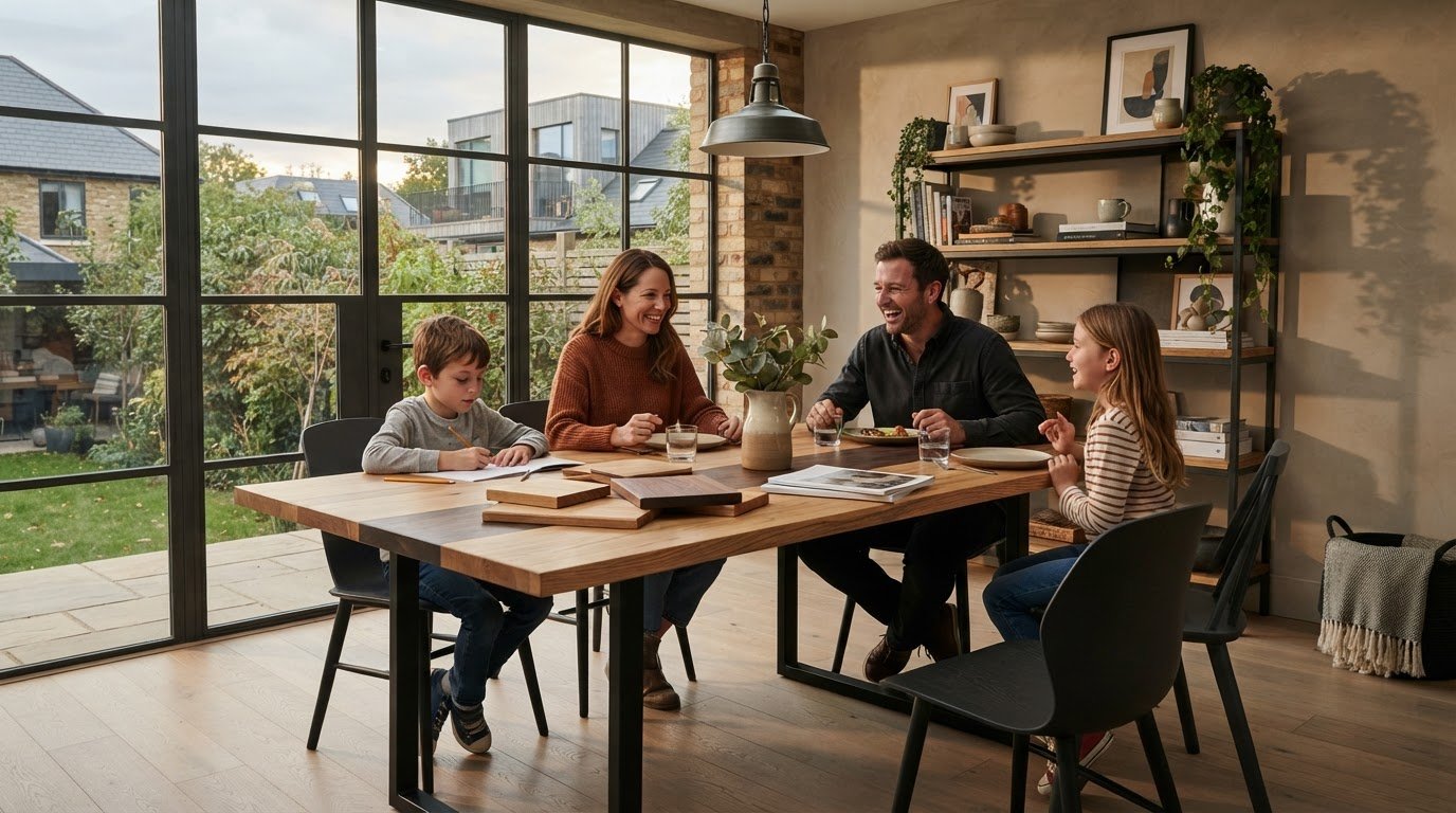
The closest match isn’t always the one that feels right. When choosing a wood tone for your home, a dining table that contrasts with your flooring can bring the room to life, while a near-match may look unintentionally off. It’s understandable to worry that different timbers will clash, especially when daylight can change how warm, pale or deep a surface appears.
Look beyond lightness and darkness. A timber’s undertone, its surrounding materials and the quality of light all shape how it looks in a room. Once you know what to compare, mixing wood tones becomes less of a guessing game and more of a considered way to add depth and character.
This guide explains how to read warm and cool undertones, assess your room’s natural light and build a balanced palette around existing flooring and furnishings. It also looks at the character of European oak, European ash, black walnut and Swedish pine, and how a handcrafted dining table can become a focal point among the materials already at home.
Key Takeaways
- Start with your room’s largest and most permanent wood surfaces to identify the tones that already anchor the space.
- When choosing a wood tone for your home, consider its undertone as well as whether it is light, mid-tone or dark.
- Mix timber deliberately: establish a dominant tone, add a supporting one, then decide where contrast will bring balance.
- Compare wood samples beside your floors, walls and cabinetry at different times of day before settling on a choice.
- Choose a dining table with its everyday role in mind, so its natural character suits both daily meals and shared occasions.
Choosing a wood tone for your home starts with the room, not the furniture
A new wooden table can make a welcome focal point, but it’s natural to wonder whether its colour will clash with the floor, cupboards or other furnishings. Read the room before choosing the furniture. This helps you identify which tones already anchor the space and where a new piece could add balance or contrast.
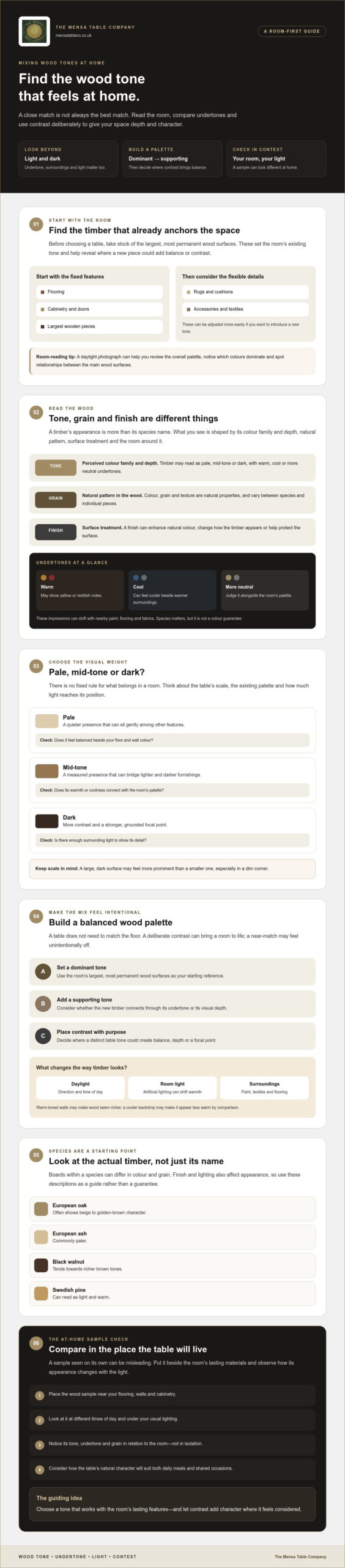
Wood tone is the perceived colour family and depth of timber; grain is its natural pattern, and finish is the surface treatment that can alter its appearance or protect it. Timber may read as pale, mid-tone or dark, with warm, cool or more neutral undertones. Species matters, but it isn’t the whole story. Lighting, nearby colours and finish all influence what you see.
Finishes can change how a surface looks, from enhancing its natural colour to giving it a different appearance. The process of wood finishing includes treatments such as staining and protective topcoats. So don’t rely on a timber name alone. If you’re considering solid European oak, check the product details and, where possible, assess a sample in your room.
How to read the room before choosing a wood tone
Take stock of the floor, cabinetry, doors and largest wooden pieces first. These are the room’s strongest timber references, particularly if they’re fixed and unlikely to change. Then note the more flexible elements, such as cushions, rugs and accessories. These can be adjusted more easily if you want to introduce a new tone.
A photograph taken in daylight can help you review the room as a whole. Notice where the main wood surfaces sit, which colours dominate and whether the overall effect feels warm, cool or balanced. A photo won’t replace seeing materials in person, but it can make relationships and contrasts easier to spot.
Why the same timber can look different at home
Light changes what the eye sees. Daylight varies with direction and time, while artificial lighting can make timber appear warmer or cooler. Paint, textiles and flooring also affect perception. Beside warm-toned walls, a wood surface may seem richer; against a cooler backdrop, it may appear less warm by comparison.
That’s why choosing a wood tone for your home is best done in context. If a sample is available, place it near the floor, cabinetry and other key materials. Look at it at different times of day and under your usual lighting. A tone that works beside the room’s lasting features is more likely to feel at home there.
Light, dark and undertones: what changes a wood tone’s character?
Pale, mid-tone and dark timber each bring a different visual weight to a room, but none is a rule for what belongs where. Pale wood can feel visually quiet, allowing other details to take the lead. A darker table may create contrast and a grounded focal point. Mid-tones can connect lighter and deeper elements. Consider the furniture’s scale as well as the light around it: a large, dark surface may feel more prominent than a smaller one, especially in a dim corner.
Undertones add another layer. Timber may appear warm, with yellow or reddish notes, cooler, or relatively neutral. These impressions aren’t fixed. Paint, flooring and fabrics nearby can make the same wood look warmer or cooler by comparison. As Purdue University Extension explains in its overview of wood colour and texture, colour, grain and texture are natural properties of wood, and they vary between species and pieces.
Compare the effect in your room
| Timber tone | Possible visual effect | Sample-check prompt |
|---|---|---|
| Pale | A quieter presence that can sit gently among other features. | Does it feel balanced beside your floor and wall colour? |
| Mid-tone | A measured presence that can bridge lighter and darker furnishings. | Does its warmth or coolness connect with the room’s existing palette? |
| Dark | More contrast and a stronger, grounded focal point. | Does the room have enough surrounding light to show its detail? |
How timber species relate to tone
Species offer a useful starting point, not a colour guarantee. Solid European oak often shows beige to golden-brown character, while European ash is commonly paler. Black walnut tends towards richer brown tones, and Swedish pine can read light and warm. Boards within each species still differ in colour and grain, and finish can alter the appearance. Look at the actual timber and product details rather than relying on a species name alone. You can explore the solid European oak timber category as one example, alongside the company’s listed black walnut timber.
Grain is the visible arrangement of lines and markings; tone is the overall colour impression. Natural variation in grain can make two boards with a similar tone feel quite different. Finish matters, too: it may bring out colour and texture or change how light reflects from the surface. Compare samples in your room, beside key materials and under both daylight and your usual artificial lighting. If you’re weighing up a timber for a dining table, you can discuss your space and preferences with the company.
How to mix wood tones without making a room feel mismatched
Every wooden item in a room doesn’t need to match. A perfectly uniform set can feel less personal, while a considered mix adds depth and character. The aim is to make the differences look deliberate rather than accidental.
Try this framework: establish a dominant timber tone, choose a supporting tone, then decide whether you want a clear contrast. If the floor is the largest wooden surface, let it anchor the scheme. A dining table in a contrasting tone can become a focal point, while a smaller timber detail elsewhere can help connect the two.
Choose a dominant timber tone and build around it
Begin with the largest or most visually prominent existing wood surface, such as flooring, cabinetry or a substantial piece of furniture. Select one or two smaller details that repeat or relate to its tone, rather than repeating it everywhere. Contrast can work beautifully, but give it a clear role in the palette. For example, a lighter table against darker floors can feel more intentional if its difference is echoed in another detail.
Not every connection needs to come from wood. A rug can create a visual pause between a table and the floor beneath it. Painted walls or cabinetry can separate adjacent timber surfaces, while upholstery and metal details can help tie different colours and textures together. These materials give the eye places to rest, so the wood tones don’t have to match exactly to sit comfortably in the same room.
Intentional repetition and contrast can make mixed wood tones feel coherent. Think of repetition as a quiet thread through the room, not a reason to use the same timber on every surface.
Coordinate a wooden dining table with floors and furniture
A dining table has a strong presence, so consider more than its colour. Compare a sample beside your flooring and cabinetry in the room’s usual lighting, then consider how the table’s size and frame design relate to nearby furniture. A substantial tabletop may make a tone feel more prominent; an open frame may leave more of the floor visible. Chairs, benches and other nearby pieces also shape the balance.
As you narrow down your choice, decide whether the table should blend into the room or stand apart as its focal point. Choosing a wood tone for your home becomes easier when you settle on that role first, then assess the timber in context rather than in isolation. Explore the dining table options and compare the product details with your room’s palette.
A practical checklist for testing a wood tone in your home
Choosing a wood tone for your home gets easier when you move from first impressions to a simple room-by-room check. You don’t need every wooden surface to match exactly. The aim is to understand what’s already there, decide how the new piece should relate to it, and check the actual timber in your own light before committing.
A five-step wood-tone selection process
- Record the fixed wood elements. Note the floor, doors, built-in cabinetry and any large pieces you’re keeping. Mark each as light, mid-tone or dark, and note whether it appears warm, cool or neutral.
- Decide on the atmosphere. Consider whether you want the room to feel calm and blended or more layered, with a clear contrast. This gives the new tone a purpose instead of leaving you to choose by colour alone.
- Choose a relationship. Look for a supporting tone that relates to the dominant timber, or choose a contrasting one that can stand out deliberately. You don’t need to match every wood in the room.
- Place samples in context. If samples are available, set them beside the floor, walls and cabinetry rather than judging them on a plain surface. View them from different parts of the room, too.
- Review the sample at different times. Check it in daylight and again in the evening under your usual lighting. Notice whether its warmth, depth or contrast still feels right as the light changes.
Make a quick note or take a photograph at each stage. This makes it easier to compare options without relying on memory, especially if you’re considering more than one timber.
Questions to ask before choosing wooden furniture
Before deciding, check the details for the specific piece. How is the timber described? Is the finish identified? Does the maker explain that natural variation in colour or grain means the finished item may differ from photographs or a sample? These details help set realistic expectations, since each piece of timber has its own character.
If an important detail isn’t clear, ask the maker before you choose. For a handcrafted dining table, you might want to confirm which timber and finish information applies to that particular table, rather than assuming details from another piece will be the same. You can contact the team with questions about your space and timber choice before making your decision.
Use the checklist as a guide, not a test with one perfect answer. A room can feel balanced with woods that differ in tone, provided the choice works with its lasting materials and the atmosphere you want to create.
Choosing a handcrafted table tone that belongs in your home
A dining table brings together the choices explored in this guide: the room’s light, its existing materials, the atmosphere you want and how an actual timber sample looks in place. Consider each before deciding. A table is more than a colour in the room; it becomes part of everyday meals, conversations and gatherings, so its tone should feel comfortable in daily life as well as pleasing at a glance.
The Mensa Table Company makes handcrafted dining tables in several frame styles, using listed timber categories that include solid European oak, solid European ash, solid black walnut and solid Swedish pine. Each timber has its own natural character, and the right choice depends on how its appearance sits with your home. Check the details for the specific table you’re considering rather than assuming every timber or finish is available across the range.
Match the table to the way the room is lived in
Think about the table’s place in the room and how you’ll use it. If it’s a central gathering point, a tone that provides considered contrast may help it stand out; a more related tone can create a quieter connection with existing furniture. Scale and frame design affect its visual presence, too, so assess the whole table against the floor, chairs and cabinetry, not just a small patch of colour.
If matching benches are part of the seating plan, decide whether you want them to repeat the table’s tone or add another layer to the palette. Coordinated seating can help the dining area feel considered, while a rug, upholstery or painted surface can soften the transition to nearby timber. Explore the matching benches as you think through how the seating will sit with your table and room.
Explore timber options and ask for guidance
European ash and Swedish pine offer useful starting points for comparison, but their names alone can’t tell you exactly how a particular piece will look at home. Natural variation between boards, along with the stated finish, affects the final appearance. Review the product information and, where possible, compare a sample with your flooring, walls and cabinetry in the room’s usual light. Choosing a wood tone for your home is ultimately a decision about the specific piece in its surroundings.
Before settling on a table, confirm the current timber availability and finish details for that particular option. If the information leaves an important question unanswered, share what you’re working with, such as your room’s light, existing wood and preferred atmosphere. Contact the team to discuss your room and suitable table options. A little considered guidance can help you choose a lasting focal point that feels at home around the people who gather there.
Choose a timber that feels at home
The right table tone doesn’t need to match every wooden surface around it. Start with the room’s light and lasting materials, then decide whether your table should blend into the palette or create considered contrast. Looking at a sample in place can help you judge the choice with confidence.
Choosing a wood tone for your home is also about finding a piece that belongs in everyday life. A handcrafted dining table can become a natural gathering point for daily meals and shared occasions. The listed timber categories include solid European oak, European ash, black walnut and Swedish pine. Check the details for the specific table to understand its current timber and finish options.
If you’re weighing up what might suit your room, talk to us about choosing a table for your home. Share the materials and atmosphere you have in mind, and take the next step towards a table that feels truly yours.
Frequently Asked Questions
Do all the wood tones in a room need to match?
No, different wood tones can sit comfortably together without being identical. Start with the most prominent timber, such as the floor, then choose furniture that either relates to its undertone or contrasts clearly. For example, a lighter table against darker flooring can look deliberate if the difference feels purposeful. Rugs, upholstery and painted surfaces can connect the materials without making the room feel overly uniform.
How do I choose a wood tone for a room with dark floors?
With dark floors, consider whether you want your furniture to blend in or stand out. A lighter or mid-tone table can create definition against the floor, while another deep tone can give the room a more unified, grounded feel. Consider undertones as well as lightness: compare samples beside the floor and nearby cabinetry, and check them in the room’s usual daylight and evening lighting.
Can you mix light and dark wood furniture?
Yes. Light and dark timber can create useful contrast and give a room a more layered feel. Choose which tone will dominate, then make the difference look intentional rather than like an almost-match. For instance, a pale coffee table can stand apart from darker furniture, while a small detail that repeats one of those tones can help connect the scheme. The surrounding colours and materials matter, too.
How does lighting affect the colour of wood?
Lighting can change how warm, cool or deep timber appears. Daylight shifts throughout the day, and the direction of the light affects which parts of a surface are bright or shaded. Artificial lighting can also alter the impression of a wood tone. Check a sample where the furniture will sit, both during the day and under your usual evening lights, before deciding.
Which wood tone works best with oak flooring?
There isn’t one best tone, because oak flooring varies in colour, grain and warmth. A table with a related undertone can create a calm, connected look, while a distinctly lighter or darker tone can provide contrast. You don’t have to choose oak furniture to go with oak floors. Compare actual samples beside the flooring, and consider how walls, cabinetry and other furnishings affect the overall palette.
How can I tell whether a wood sample will suit my home?
Place the sample near the floor, walls and cabinetry where the furniture will go, then view it at different times of day and under your usual artificial lighting. Notice its overall depth and undertone, as well as the grain and natural variation. Check the product details for the timber and finish, too. A sample is a useful guide, but the finished piece may vary from sample images.
Is a darker wood tone always better for a statement dining table?
No. A table can become a focal point through its scale, shape, frame design or natural grain, not just a dark tone. Dark timber may create strong contrast, but a lighter or mid-tone table can also stand out against darker flooring or furnishings. Consider the room’s light and the table’s visual presence, then decide whether you want it to contrast with the palette or sit more quietly within it.

Leave a Reply